Категории:
ДомЗдоровьеЗоологияИнформатикаИскусствоИскусствоКомпьютерыКулинарияМаркетингМатематикаМедицинаМенеджментОбразованиеПедагогикаПитомцыПрограммированиеПроизводствоПромышленностьПсихологияРазноеРелигияСоциологияСпортСтатистикаТранспортФизикаФилософияФинансыХимияХоббиЭкологияЭкономикаЭлектроника
To emphasize smth – выделять, подчёркивать (что-л.), придавать особое значение (чему-л / кому-л)
ABBREVIATIONS
N.B. Mind that the majority of the Latin phrases read aloud are commonly substituted by the corresponding English ones. These are given in the bold type.
1. Parts of speech:
1.1. Notional words знаменательные (понятийные) слова:
a – adjective – прилагательное
adv – adverb – наречие
n – noun – существительное
num – numeral – числительное
v – verb – глагол
1.2. Structural / formal words служебные слова
prep – preposition – предлог
pron – pronoun – местоимение
cj – conjunction – союз
int – interjection – междометие
part – particle – частица
2. Linguistic terms
ant. – antonym – антоним
homo. – homonym – омоним
homoph. – homophone – омофон
pl – plural (number of the noun) – множественное (число существительного)
sg singular (number of the noun) – единственное (число существительного)
syn. – synonym – синоним
3. Miscellaneous words & word combinations
A.D. – (Latin) Anno Domini (= English “the year of God”) – года Господа (нашей эры)
B.C. – Before Christ – до рождества Христова (до нашей эры)
cf. – (Latin) confer (= English “compare”) – сравните
e.g.– (Latin) example gratia (= English “for example”) – например
etc.– (Latin) et cetera (= English “and so on”) – и так далее
i.e. – (Latin) id est (= English “that is”) – то есть
N.B. – (Latin) nota bene (= English “good to remember”) – полезно запомнить
smb – somebody – кто-либо
smth – something – что-либо
viz. – (Latin) videlicet [vi'di:liset] (= English “namely”) – а именно, … (перед перечислением)
vs – (Latin) versus (= English “against”) – против
v.i. – (Latin) vide infra (= English “see below”) смотри ниже
v.s. – (Latin) vide supra (= English “see above”) смотри выше
& (= English “and”) – и (союз)
N.B.: In dictionaries the indefinite pronoun forms “one's” and the abbreviated “smb's, “smth's” are used conventionally, whereas in actual speech they are substituted by the situationally required words: “one's” by a possessive pronoun, “smb's”, “smth's” by a possessive pronoun, or a noun in the possessive case.
The difference between them is as follows:
1. “one's”is a conventional sign for a possessive pronoun referring to something belonging to the doer of the action. In speech “one's” isrealized as a corresponding possessive pronoun.
e.g. I tried myhand at teaching.
He tried his hand at teaching.
She triedher hand at teaching.
We triedour hands at teaching.
You triedyourhand(s) at teaching.
They triedtheir hands at teaching.
2. “smb's” and “smth's” are conventional signs for a possessive pronoun or a noun in the possessive case referring to something belonging to some second or third person(s) – not the doer of the action.
e.g. I drive his car. I took John'sbook.
I drive hercar. I took my sister'sbook.
I drive our car.
I drive yourcar.
I drive theircar.
UNIT I
VERBS
1. to call smth (some name) [kɔ:l] – называть (что-л.) (каким-л. именем)
to be called (some name) – называться (каким-л. именем)
syn. to be referred to as (some name),to be termed (some name)
2. to coin a term ['kɔɪn ə 'tз:m] – создать (придумать) слово (термин)
syn. to mint a term
3. to convey a (specific) message to smb – (до)нести (определённую) информацию до кого-л.
4. to create smth [krɪ'eɪt] – создавать (что-л.)
syn. to generate, bring /call/ into being, make, produce
To emphasize smth – выделять, подчёркивать (что-л.), придавать особое значение (чему-л / кому-л)
syn. to accentuate, to stress, to lay /put/ stress on, to underline
6. to employ [ɪ'mplɔɪ] – использовать (что-л.)
syn. to apply, to make use of, to use, to utilize
7. to enter ['entə] (some language) via ['vaɪə] (some other language) from (still some other language) (about a borrowed word) – (о лексической единице) приходить в (какой-л. язык) через (какой-л. язык посредник) из (другого какого-л. языка)
UNIT II
VERBS
1. to bind [baɪnd] – связывать: to be bound to (smth) [baʊnd] – быть связанным с (чем-л)
syn. to be associated with (smth)
2. to bring about smth ['brɪŋ ə'baʊt] – вызывать что-л (к жизни), быть причиной (чего-л)
syn. to give rise to smth
3. to call for smth – требовать чего-л
4. to come to do smth [kʌm] – стать, начать (делать что-л)
e.g. to come to be called (some name) – стать называться (каким-л именем)
5. to date back to (some past time) ['deɪt 'bæk] – датироваться (каким-л прошлым временем), относиться к (какому-л периоду)
6. toenjoy (some) years of history [ɪn'dʒɔɪ] – иметь (столько-то)летнюю историю
7. to mint (a term) – создать (придумать) слово (термин)
syn. v.s. UNIT I: to coin a term
8. topractise smth (Amer. to practice) ['præktɪs] – заниматься (какой-л деятельностью), осуществлять, применять на практике
ADJECTIVES
9. advanced (technology) – передовая (технология)
syn. cutting-edge, innovative, high(-tech), modern, progressive
10. to be appropriate to smth [ə'prəʊprɪɪt] – соотвествовать (чему-л)
11. to be effective at doing smth [ɪ'fektɪv] – эффективно (делать что-л), быть эффективными при (каком-л действии)
12. subsequent (century, etc.) ['sʌbsɪkwənt] – (по)следующий (век и т.п.)
NOUN + NOUN COMBINATION
13. job specialization process ['jɒb ˌspe∫ɪlaɪ'zeɪ∫ən 'prəʊsəs] – процесс создания (появления) рабочих мест с узкой специализацией (с чётким разделением труда)
v.i. UNIT IV: division of labour
ADVERBS
N.B.: Mind that there are many cases when one-word English adverbs may have no one-word equivalents in Russian or the latter sound too alien or bookish. That is why they are rendered as a phrase.
14. consciously ['kɒn∫əslɪ] – сознательно, (пред)намеренно
15. correspondingly [ˌkɒrɪ'spɒndɪŋlɪ] – соответственно, соответствующим образом
16. increasingly [ɪn'kri:sɪŋlɪ] – всё в большей степени (мере)
17. newly (minted) – только что (созданный), “свежеиспечённый”
18. textually ['tekst∫ʊəlɪ] – в виде текста, с помощью текста
cf. (букв.) «текстуально»
SET PHRASES
19. among other things [ə'mʌŋ 'ʌðə 'θɪŋz] – между прочим, в частности
20. because of smth [bɪ'kɔ:z əv] – из-за (чего-л)
syn. due to, owing to, thanks to (благодаря (чему-л), through
21. in part [ɪn 'pɑ:t] – отчасти
22. over the course of (some period of time) [əʊvə ðə 'kɔ:z] – в течении (какого-л периода), за (какой-л период)
syn. during,throughout
23. through (the use of) ['θru: (ðə 'ju:s əv)] – посредством (использования чего-л)
syn. v.s. UNIT I: employing (Participle I form of “to employ”), etc.
24. the turn of some century['tз:n] – начало какого-л века, рубеж каких-л веков
PROFESSIONAL TERMS
25. blend [blend] – смесь
syn. mix, variety
26. book jacket ['bʊk ˌdʒækɪt] – суперобложка книги
27. сeramics [sɪ'ræmɪks] – керамика, гончарное производство
syn. earthenware, pottery, stoneware
28. compact-disc cover – обложка компакт-диска
29. compositor [kəm'pɒzɪtə] – наборщик
syn. typesetter
30. communication medium (pl –dia) ['mi:dɪəm -dɪə] – средство передачи информации, носитель информации
31. kinetic title [k(a)ɪ'netɪk 'taɪtl] – анимационная заставка (телепередачи)
32. postage stamp ['pəʊstɪdʒ 'stæmp] – почтовая марка
33. poster ['pəʊstə] – плакат, постер
34. printing ['prɪntɪŋ] – печатное дело, печать
35. practitioner – исполнитель
syn. master,professional artist
36. relic ['relɪk] – остаток (материальной культуры какой-л эпохи, цивилизации), артефакт
37. to set the type ['set ðə 'taɪp] – набирать шрифт
38. scribe ['skraɪb] – писец, переписчик (в древности)
39. trademark ['treɪdmɑ:k] – торговая марка
40. typesetter – v.s. compositor
CULTUROLOGICAL & HISTORICAL TERMS
41.the Industrial Revolution [ði ɪn'dʌstrɪəl ˌrevə'lu:∫(ə)n] – Промышленная революция
CONSTRUCTION
N.B.: Mind the inverted usage of the verb-substitute “do” in the clause of comparison:
42. Smb/Smth/ does smth as does smb/smth/ else
e.g. John works as a designer as does Pete. Джон работает дизайнером (также) как и Пит.
UNIT III
VERBS & COMBINATIONS WITH VERBS
1. to echo in smth ['ɪkəʊ] – повторяться, отражаться, вториться в чём-л
2. to father smth ['fɑ:ðə] – порождать что-л
syn. to generate smth, give birth to smth, to give rise to smth
COMBINATIONS WITH ADJECTIVES
3. a cohesive whole [kəʊ'hi:sɪv 'həʊl] – единое целое
4. to be responsible for smth – отвечать (быть ответственным) за что-л
NOUNS & COMBINATIONS WITH THEIR ATTRIBUTES
5. advent ['ædvənt] – прибытие, приход, появление
syn. arrival, emergence
6. time-consuming production ['taɪm kən'sju:mɪŋ prə'dʌkʃən] – трудоёмкое производство
ADVERBS
7. fairly ['feəlɪ] – довольно, достаточно, в известной степени
syn. quite, rather, somewhat, (разг.) pretty
8. vibrantly (to contrast with smth) – живо, резко, ярко (контрастировать с чем-л)
SET PHRASES
9. as early as (some time) – уже в (какое-л время)
10. both … and … [bəʊθ … ənd] – (correlative conj. – парный союз) и …, и …; как …, так и …
PROFESSIONAL TERMS
11. brush [brʌʃ] кисть; (перен.) работа кистью (также brushwork)
12. to brush [brʌʃ] – наносить кистью
13. flat colour ['flæt 'kʌlə] – блеклый, тусклый цвет
N.B.: Mind the word-order change in the translation of the combination:
flat areas of colour – участки тусклого цвета
14. illuminated manuscript [ɪˌl(j)u:mɪ'neɪtɪd 'mænjuskrɪpt] – иллюминированная рукопись (богато украшенная золотом, серебром, драгоценными камнями и рисунками)
15. illuminator [ɪˌl(j)u:mɪ'neɪtə] – художник-иллюминатор (оформитель и иллюстратор рукописей цветными рисунками)
16. initial ['ɪnɪʃ(ə)l] (letter) – заглавная (буква)
syn. capital letter – большая, прописная (буква)
17. ink [ɪŋk] – чернила
18. hieroglyphic writing [ˌhaɪ(ə)rə'glɪfɪk 'raɪtɪŋ] – надпись иероглифами
19. to lay out a page ['leɪ 'aʊt ə 'peɪdʒ] – размечать, планировать страницу
20. letterer ['letərə] – шрифтовик
21. marginalia [ˌmɑ:dʒɪ'neɪljə] (в полиграфии) боковушки, маргиналии, поля (книги), сноски на полях (книги)
22. nib [nɪb] – (заострённый) кончик (обычно гусиного пера), перо (пишущей ручки)
23. parchment ['pɑ:tʃmənt] – пергамент
24. stroke [strəʊk] – штрих
25. substrate ['sʌbstreɪt] – основание, основа
syn. substratum (pl –ta)
26. texture ['tekstʃə] текстура, структура, фактура
27. vellum ['veləm] – (тонкий) пергамент, пергамен (кожа), велень, веленевая бумага, плотная писчая бумага
CULTUROLOGICAL & HISTORICAL TERMS
28. aphabet ['ælfəbɪt] – азбука, алфавит. В тексте различают:
29. Cyrillic a. [sɪ'rɪlɪk] – кириллица, славянская азбука, русский (болгарский, сербский) шрифт
30. Etruscan a. [ɪ'trʌskən] – этрусский алфавит. Этруски – древние племена, населявшие в первом тысячелетии до н.э. северо-запад Аппенинского полуострова, древнюю Этрурия, современную Тоскану.
31. Greek a. [ɡri:k] – (древне)греческий алфавит
32. Latin a. ['lætɪn] – латинский алфавит
33. Phoenician a. – Финикийский алфавит. Один из первых зафиксированных в истории человечества систем фонетического письма, появившийся около XIII века до н. э. и давший начало практически всем алфавитным системам, существующим на сегодняшний день.
34. city-state [ˌsɪtɪ'steɪt] – полис (город-государство у древних греков)
35. codex (pl. сodices) – рукописная книга (Библия, сборник античных писателей, древние рукописи)
36. copista [kə'pɪstə] (из итальянского) (= English copyist) переписчик
syn. v.s. UNIT III: scribe
37. monastic scriptorium [mə'næstɪk skrɪp'tɔ:rɪəm] – монастырское помещение для переписки рукописей
38. scrittore (pl –ri) [skrɪ'tɔ:rə -rɪ] – (из итальянского) (= English scribe)писец, писарь, переписчик
39. scroll ['skrəʊl] – свиток (как вид рукописи)
syn. roll
40. uncial (writing style) ['ʌnsɪəl] – унциальный (стиль письма). Вариант одного из основных типов обычного письма III—V вв. Характеризуется крупными, округлыми буквами без острых углов и ломаных линий.
CULTUROLOGICAL & HISTORICAL TERMS
41. the Egyptian Book of the Dead [ði ɪ'dʒɪp∫(ə)n 'bʊk əv ðə 'ded]
– Египетская Книга Мёртвых
42. the Roman Empire[ðə 'rəʊmən 'empaɪə] – Римская Империя
MANUSCRIPT DESIGN IN ANTIQUITY
Although its advent (5) as a profession is fairly (7) recent, graphic design has roots that reach deep into antiquity. The invention of the alphabet (28) (from the first two letters of the Greek alphabet (32), alpha and beta) made possible to represent the sounds of a spoken language by a set of visual symbols transferred to a special surface. The ancient Greeks adopted the “Phoenician alphabet” (34) and spread it through their city-states (35) around 1000 BC. As early as (9) 2nd century A.D., the Greeks developed a more rounded writing style called “uncial” (40). This script could be written more quickly because its rounded letters were formed with fewer strokes (24). Greek scribes made their pens from hard reeds, cut into a nib (22) and split at the 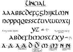 tip to aid ink (17) flow. These pens gave their writing a totally different character than writing by Egyptian scribes, who used soft reeds to brush (12) ink (17) on the substrate (25). The Greek alphabet fathered (2) the Etruscan (31), Latin (33), and Cyrillic (30) alphabets.
The manuscripts made in ancient China, Egypt, Greece and Rome were richly illustrated. In a manuscript the text was supplemented by the addition of decoration, such as decorated initials (16), marginalia (21) and miniature illustrations. The luminosity of gold and silver reflecting light from the pages of handwritten book, gave the sensation of the page being illuminated; this effect gave birth to the term “illuminated manuscript” (14). Today this name is used for all decorated and illustrated handwritten books produced from the late Roman Empire until typography was developed in Europe around 1450.
Manuscript production was costly and time consuming (6). Around 190 B.C. in the Roman Empire, parchment (23), made from the skins of domestic animals, began to be used as a substrate (25). Vellum (27), the finest parchment (23), is made from the skin of newborn calves. With the use of parchment (23), the codex (35) (book form) began to compete with the scroll (39). Nearly all books were created in the monastic scriptorium (37) or writing room. Its head was the “scrittore” (38), a well educated scholar who understood Greek and Latin and functioned as both editor and art director. The scrittori (38) laid out the pages (19) to indicate where the illustrations were to be added after the text was written. The “copista” (36) was a production letterer (20) who spent his days bent over a writing table penning pages in a trained lettering style. The illuminator (15) or illustrator was an artist responsible for (4) ornamentation and images.
The ancient Egyptian Book of the Dead, which contained texts intended to aid the deceased in the afterlife, is a superb example of early graphic design. Hieroglyphic narratives penned by scribes are supplied with colourful illustrations on rolls of papyrus. Words and pictures are unified into a cohesive whole (3): both elements are compressed into a horizontal band, the repetitive vertical structure of the writing is echoed (1) in both the columns and (10) the figures, and a consistent style of brushwork (11) is used for the writing and drawing. Flat areas of colour (13) are bound by firm brush (11) contours that contrast vibrantly (8) with the rich texture (26) of the hieroglyphic writing (18).
Illustrations: 1. Uncial – the book hand of 5th – 8th centuries 2. Papyrus page from the Book of the Dead, 18th dynasty; in the Egyptian Museum, Turin, Italy. Egyptian Museum, Torino, Italy
UNIT IV
VERBS & COMBINATIONS WITH VERBS
1. to depict smth as …[dɪ'pɪkt] – изображать что-л как …
2. to exert influence upon smth [ɪg'zз:t 'ɪnflʊəns ə'pɒn] – оказывать влияние на что-л
syn. to have influence upon smth, to influence smth, to have impact upon smth
3. to jot a note (in the margin) ['dʒɒt ə 'nəʊt] – сделать отметку (на поле страницы книги)
4. to give way to smth ['gɪv 'weɪ] – уступить чему-либо, отступить и дать дорогу чему-либо
COMBINATIONS WITH ADJECTIVES
5. to be mindful of smth – уделять внимание чему-л, помнить о чём-л, не забывать о чём-л
6. oriental trend [ɔ:rɪ'entl 'trend] – восточный мотив (в искусстве)
7. to be versed in (some art, occupation, language, etc.) – быть сведущем в (каком-л искусстве, занятии, языке, и т.п.)
NOUNS & COMBINATIONS WITH THEIR ATTRIBUTES
8. division of labour – разделение труда
v.s. UNIT II: job specialization process
ADVERBS
9. greatly (to influence smth) ['greɪtlɪ] – в значительной мере (степени), сильно (повлиять на что-л)
10. intricately ['ɪntrɪktlɪ] – замысловато, затейливо
11. primarily ['praɪmərɪlɪ] – в основном, главным образом
syn. chiefly, essentially, predominantly, principally
– в первую очередь; изначально
syn. firstly, originally
SET PHRASES
12. rather than ['rɑ:ðə 'ðæn] – а не …, но не …
e.g. They made up their mind to die rather than surrender. – Они решили скорее умереть, чем сдаться.
13. a vast variety of smth ['vɑ:st və'raɪətɪ] – большое разнообразие чего-л
syn. an abundance of …, a great number of …, quite a number of …, a lot of …, lots of …, plenty of …
PROFESSIONAL TERMS
14. approach [ə'prəʊtʃ] – подход (в искусстве или науке)
15. editorial content – редакторская часть работы (оформление)
16. margin ['mɑ:dʒɪn] – поле (страницы книги)
17. overtone ['əʊvətəʊn] – нотка, подтекст
18. pattern ['pæt(ə)n] – узор; модель
19. (semi-)precious stone [ˌsemɪ'preʃəs 'stəʊn] – (полу)драгоценный камень
20. to treat (some material) – обрабатывать (какой-л материал)
treated – обработанный
CULTUROLOGICAL & HISTORICAL TERMS
21. Byzantine Empire [bɪ'zæntaɪn 'empaɪə] – Византийская Империя
22. Сrusader [kru:'seɪdə] – крестоносец
23. gospel book ['gɒsp(ə)l] – евангелие, Новый Завет
24. Hiberno-Saxon (Insular) style [haɪ'bз:nəʊ 'sæks(ə)n] – ирландско-саксонский (островной) стиль
25. International Gothic style ['gɒθɪk] – стиль “интернациональная готика” (Стилистический вариант последних этапов готики, развившийся в Бургундии, Богемии и Северной Италии примерно с 1380 по 1430 годы. Термин был предложен в 1890-х годах историками искусства Луи Куражо (Франция) и Юлиус фон Шлоссер (Австрия)).
26. Matthew 1:18 ['mæθju:] – Евангелие от Матфея, глава 1, стих 18
27. paradigm ['pærədaɪm] – образец, пример, экземпляр; (спец. парадигма)
syn. case, example, instance
28. crusaders' sack of Constantinople – разорение (разграбление) Константинополя крестоносцами
CONSTRUCTION
29.N.B.: Take care to do an adequate translation into Russian of the varieties of the COMPLEX SUBJECT construction with:
1. The Indefinite Infinitive: Smb / smth is believed to do smth
e.g. John is believed to respect his friends. – Считается, что Джон уважает своих друзей. (Сейчас)
2. The Indefinite Passive Infinitive: Smb / smth is believed to be done
e.g. John is believed to be respected by his friends. – Считается, что Джона уважают его друзья. (Сейчас)
3. The Perfect Infinitive: Smb / smth is believed to have done
e.g. John is believed to have respected his friends. . – Считается, что Джон уважал своих друзей. (В прошлом)
4. The Perfect Passive Infinitive: Smb / smth is believed to have been done
e.g. John is believed to have been respected by his friends. – Считается, что Джона уважали его друзья. (В прошлом)
UNIT V
VERBS & COMBINATIONS WITH VERBS
1. to blossom ['blɒsəm] – процветать
syn. to bloom, to flourish, to thrive
N.B. Mind the possibility of two different prepositions following one verb in English making the meaning of the verb slightly modified which requires using two verbs in the Russian translation:
2. to spread across (some territory) and into (some other territory as well) – распространиться по (какой-л территории), а также попасть (ещё на какую-л территорию)
COMBINATIONS WITH ADJECTIVES
3. literary, historical, herbal work – литературное произведение, работа по истории, книга-травник (с описанием лекарственных растений)
NOUNS
4. amount of smth [ə'maunt] – количество (чего-л)
syn. quantity
to require an enormous amount of labour – быть трудоёмким (о работе)
syn. v.s. UNIT III: time-consuming (production)
5. antecedent [ˌæntɪ'si:dənt] – предшественник, предпосылка (чего-л)
syn. ancestor, ascendant, foregoer, forerunner, harbinger, predecessor, prototype
6. landmark ['lændmɑ:k] – веха, поворотный пункт (в истории, и т.п.)
Gutenberg's landmark 42-line Bible – новаторская “42-строчная Библия” Гутенберга
7. point (in some activity) – уровень, стандарт (в какой-л деятельности)
syn. level
8. range of smth ['reɪndʒ] – диапазон, предел (чего-л)
ADVERBS
9. mainly ['meɪnlɪ] – главным образом
syn. by and large, chiefly, largely, mostly, on the whole, predominantly
10. subsequently ['sʌbsɪkwəntlɪ] – впоследствии, позднее, позже, после, потом
syn. afterwards, later (on)
11. truly ['tru:lɪ] - действительно, по-настоящему; в полном смысле слова
SET PHRASES
12. in effect – фактически
13. in this way – таким образом
14. of all other … – из всех других … (= (Не где либо ещё, а) именно)
e.g.: Of all other cultures, major advances in graphic design were centred in Europe. Именно в Европе сосредоточились основные линии развития графического дизайна.
PROFESSIONAL TERMS
15. apply (ink to a surface) [ə'plaɪ] – наносить (чернила на поверхность)
16. artisan [ˌɑ:tɪ'zæn] – ремесленник, мастеровой
17. (decorative) border ['bɔ:də] – (декоративная) кайма, окантовка (страницы)
18. broadside ['brɔ:dsaɪd] – большой лист бумаги с печатным текстом на одной стороне
syn. broadsheet
19. to carve [kɑ:v] – вырезать, резать (по дереву, кости); гравировать
20. to cast [kɑ:st] – отливать, лить (металл)
syn. to mould, to found
21. fibre ['faɪbə] – волокно, нить
22. header – заголовок
syn. heading, title, (газетный) headline
23. movable-type printing – печать с использованием съёмного наборного шрифта
24. ornate (initial) – изысканно украшенный, витиеватый (о заглавной букве, и т.п.)
syn. ornamental – орнаментальный, декоративный, служащий украшением
25. to paste smth together – склеивать что-л вместе
26. a raised carved surface – рельефная (выпуклая) резная поверхность (печатной таблички)
27. relief printing – высокая печать (способ печати, использующий формы, на которых печатающие элементы расположены выше пробельных. Краска наносится на поверхность выступающих печатных элементов. При соприкосновении с бумагой, для полного перехода краски, необходимо давление пресса.)
28. to replicate ['replɪkeɪt] – делать копию, копировать (какое-л изделие, произведение искусства)
syn. to copy, to reproduce
29. a tablet with a character – табличка (дощечка) с печатным знаком (литерой, цифрой)
30. type ['taɪp] – печатная матрица, шрифт
31. woodblock printing – ксилографическая печать (греч., от xylon – дерево, и grapho – пишу). Искусство печатания деревянными резными досками; китайский способ печатания.
syn. v.i. UNIT VI: woodcut printing
CULTUROLOGICAL & HISTORICAL TERMS
32. Johannes Gutenberg [dʒəʊ'hæni:s 'gu:tənbз:g] – Иоганн Гуттенберг (1397 или 1400 – 1468) – немецкий ювелир и изобретатель. Создал европейский способ книгопечатания подвижными литерами.
CONSTRUCTIONS
N.B.: Mind the structure and ways of translation of
33. – “cleft sentences”, e.g.: It was John who helped me.
A cleft sentence is one where a simple sentence has been split (or ‘cleft’) into two clauses, thus bringing different clause elements into focus. The stress is laid on the final element of the clause introduced by “it”, while the subsequent clause introduced by “what”, “who”, “when”, etc. (“wh-cojunctives”) or “that” repeats given, previously known and thus less important information:
It was with the development of printmaking technologies that the art and practice of graphic design truly blossomed.
Именно (Только) с развитием печатного дела искусство и практика графического дизайна расцвели по-настоящему.
34. – Absolute Constructions with Participle II:
Paper money and playing cards were also designed, their designs cut into woodblocks and printed.
Также создавались банкноты и игральные карты, причём их образ вырезался на деревянных болванках и затем печатался. (придаточное предложение сопутствующего обстоятельства).
35. – “for-phrase” (for + n + infinitive):
Spaces were left for illuminators to add pictures. Оставляли свободные места, чтобы потом иллюстраторы добавили туда рисунки.
36. – have smth done:
Printers printed decorative borders and ornamental initials along with the type, subsequently having colour applied by hand to these printed elements.
Мастера печатали вмести со шрифтом декоративные обрамления витиеватые заглавные буквы, а затем на эти графические элементы вручную наносилась краска.
То есть, мастера-печатники последний этап работы выполняли не сами, а перепоручали его специалистам в этой области - художникам.
UNIT VI
VERBS & COMBINATIONS WITH VERBS
1. to conceive smth as … [kən'si:v] задумывать что-л как …
2. to equal smth / smb ['i:kwəl] – быть равным (чему-л / кому-л)
3. to found smth (here: publishing house) – основывать что-л (здесь: издательство)
homo. to found smth [faʊnd] – отливать, лить (металл)
4. to see some process – быть свидетелем какого-л процесса
N.B.: Mind the ways of rendering the meaning of the utterances with “to see” as the predicate of an inanimate subject:
The Renaissance saw a revival, or “rebirth,” of Classical learning from ancient Greece and Rome. Во время эпохи Ренессанса произошло “возрождение” классических идей древних Греции и Рима.
COMBINATIONS WITH ADJECTIVES
5. to be available (to smb) [ə'veɪləbl]– быть доступным (для кого-л, кому-л)
syn. accessible, free, at (on) hand, handy, obtainable, open to, within reach
NOUNS & COMBINATIONS WITH THEIR ATTRIBUTES
6. fine typography – книгопечатание отличного качества
ADVERBS
7. apparently [ə'pærəntlɪ]– по-видимому, очевидно
8. exquisitely (light) [ɪk'skwɪzɪtlɪ] – изысканно, утончённо; исключительно (лёгкий)
9. importantly [ɪm'pɔ:t(ə)ntlɪ] – важно отметить, что …
10. seemingly ['si:mɪŋlɪ] – по внешнему виду, на вид
PROFESSIONAL TERMS
11. capital (letter) – большая, прописная (буква)
syn. v.s.UNIT III:initial (letter)
12. column ['kɒləm] – колонка, столбец
13. to commission smth – заказывать что-л (у художника), делать заказ на что-л
14. complement to smth ['kɒmplɪmənt] – дополнение (к чему-л)
homoph. compliment ['kɒmplɪmənt] – комплимент, похвала, любезность
15. engraving [ɪn'greɪvɪŋ] – гравюра, гравирование (по дереву, камню, металлу)
16. font [fɒnt] – комплект шрифта (набор всех букв, знаков и символов шрифта одного начертания)
17. to frame smth with smth else – обрамить что-л чем-л
18. italic (typeface) [ɪ'tælɪk] – курсивная (гарнитура шрифта), курсив
19. layout ['leɪaʊt] – макет (книги)
v.s. UNIT III: to lay out a page – размечать, планировать страницу
20. lowercase letter [ˌləʊə'keɪs 'letə] – строчная буква
ant. v.s. UNIT III: initial,capital letter
21. Old Style type / font ['əʊldstaɪl] – старомодный шрифт / комплект шрифта
22. pocket-size(d) edition ['pɒkɪtsaɪ(z_ ɪ'dɪ∫n] – карманное, миниатюрное издание
23. punch ['pʌnt∫] – пуансон (в полиграфии стальной брусок с рельефным изображением буквы или знака, служит для выдавливания изображения при изготовлении шрифтовых матриц)
24. punch-cutter['pʌnt∫kʌtə] – (гравёр-)пуансонист
25. spread [spred] – разворот (книги)
26. typeface ['taɪpfeɪs] – гарнитура шрифта
27. typefounder ['taɪpfaʊndə] – шрифтолитейщик
28. woodcut ['wʊdkʌt] – гравюра на дереве, ксилография
CULTUROLOGICAL & HISTORICAL TERMS
29. Aldus Manutius the Elder ['ɔ:ldəs mə'nʊ∫əs ði 'eldə] – Альд Мануций Старший (1449-1515) (итальянский печатник, основатель венецианского издательства «Альдин Пресс» (1495))
30. Book of Hours – Часослов (Богослужебная книга, содержащая тексты неизменяемых молитвословий суточного богослужебного круга.)
31. Carolingian period [ˌkærə'lɪnɪən] – период правления династии Каролингов (c 751 года в государстве франков – до 987 года в Западно-Франкском королевстве (Франции), до 911 года в Восточно-Франкском королевстве (Германии), до 905 года в Италии)
syn. Carlovingian
32. Claude Garamond ['klɔ:d gərə'mɔ:ŋ] – Клод Гарамо́н (ок. 1500 – 1561) (парижский пуансонист, печатник, одна из важнейших фигур французского ренессанса)
33. Francesco Colonna [frən't∫eskəʊ kə'ləʊnə] – Франческо Колонна (1433(?) – 1527) (итальянский доминиканский священник и монах, предполагаемый автор «Гипнэротомахии Полифила»)
34. Francesco Griffo – Франческо Гриффо (1450–1518) (один из первых и самых выдающихся профессиональных граверов-пуансонистов. Гравировал шрифты для типографии Альда Мануция Старшего)
35. Hypnerotomachia Poliphili – n /[hi:pˌnɪərəʊtə'mɑ:ki:ə pə'li:fəˌli:] (the Greek hýpnos (“sleep”) + éros (“love”) + máchē (“fight”) = the English Poliphilo's Strife of Love in a Dream – Гипнэротомахия Полифила (Любовное борение во сне Полифила) – мистический роман эпохи Возрождения, впервые изданный в Венеции 1499 году
36. Geoffroy Tory [ˌʒɔ:frwɑ: tə'ri:] – Жоффруа́ Тори́ (ок.1480 – до 1533)(французский художник-гравёр, книготорговец и издатель. Во многом определил стиль оформления книг во Франции XVI века; сыграл ведущую роль в деле пропаганды прямого романского шрифта в противовес более популярному в ту пору готическому.)
37. Renaissance [rɪ'neɪs(ə)ns] – Ренессанс, эпоха Возрождения
CONSTRUCTIONS
38. v.s. UNIT IV: Smth is believed to be done (by smb)
Mind the usage and ways of translation of the modal word “to seem” expressing the idea of some doubt, uncertainty, etc. on the part of the speaker
39. Smth seems (to be) adj
e.g. Additional innovation seemed unnecessary. Казалось (Похоже было), что дополнительные нововведения не требовались.
RENAISSANCE BOOK DESIGN
 The Renaissance saw a revival, or “rebirth,” of Classical learning from ancient Greece and Rome throughout Europe. Beginning from the late 15th century, printing played a major role in this process by making knowledge from the ancient world available to all readers. Typeface designs evolved toward what are now called Old Style types, which were inspired by capital letters found in ancient Roman inscriptions and by lowercase letters found in manuscript writing from the Carolingian period.
The Italian scholar and printer Aldus Manutius the Elder founded his Aldine Press in 1495 to produce printed editions of many Greek and Latin classics. His innovations included inexpensive, pocket-sized editions of books with cloth covers. About 1500 Manutius introduced the first italic typeface, cast from punches cut by type designer Francesco Griffo. Because more of these narrow letters that slanted to the right could be fit on a page, the new pocket-sized books came to be set in fewer pages.
The prototype for Renaissance book design was the Aldine Press's 1499 Hypnerotomachia Poliphili, believed to be written by Francesco Colonna. The design of the work achieves an understated simplicity and tonal harmony, and its elegant synthesis of type and image has seldom been equaled. The layout combined exquisitely light woodcuts by an anonymous illustrator with roman types by Griffo utilizing new, smaller capitals; Griffo cut these types after careful study of Roman inscriptions. Importantly, double-page spreads were conceived in the book as unified designs, rather than as two separate pages.
 During the 16th century, France became a centre for fine typography and book design. Geoffroy Tory – whose considerable talents included design, engraving, and illustration, in addition to his work as a scholar and author – created books with types, ornaments, and illustrations that achieved the seemingly contradictory qualities of delicacy and complexity. In his Book of Hours (1531), he framed columns of roman type with modular borders; these exuberant forms were a perfect complement to his illustrations.
Typeface designer and punch-cutter Claude Garamond, one of Tory's pupils, achieved refinement and consistency in his Old Style fonts. Printers commissioned types from him rather than casting their own, making Garamond the first independent typefounder not directly associated with a printing firm. Works by Tory, Garamond, and many other graphic artists and printers created a standard of excellence in graphic design that spread beyond France.
The 17th century was a quiet time for graphic design. Apparently the stock of typeface designs, woodblock illustrations, and ornaments produced during the 16th century satisfied the needs of most printers, and additional innovation seemed unnecessary.
Illustrations:1. Two-page spread from the Aldine Press's Hypnerotomachia Poliphili (1499).
UNIT VII
VERBS & COMBINATIONS WITH VERBS
1. to apprentice (at some workshop) [ə'prentɪs] – быть учеником, подмастерьем (при какой-л мастерской)
2. to assume the role of … [ə'sju:m ðə 'rəʊl əv] – брать на себя роль …
3. to enable smb to do smth позволить, дать возможность кому-л сделать что-л
syn. to allow smb to do smth, to let smb do smth
4. to pioneer smth – первым открыть, ввести, внедрить что-л
NOUNS
5. characteristic – черта, особенность
syn. feature
ADVERBS
6. slightly ['slaɪtlɪ] – слегка, чуть
PROFESSIONAL TERMS
7. casting type – (базовый) шрифт для литья
8. copperplate engraving ['kɒpəpleɪt ɪn'greɪvɪŋ] – гравирование с помощью медной печатной формы
9. curvilinear [ˌkз:vɪ'lɪnɪə]– криволинейный
10. genre ['ʒɒŋrə / 'ʒɑ:nrə] – жанр
11. to incise (a line) into (some substrate) [ɪn'saɪz] – высекать, гравировать (линию) на (какой-л основе)
12. pouce [pʊs] – (из французского) дюйм, пядь (= 27,07 мм; в Канаде = 25,4 мм), (от букв.) большой палец (руки или ноги)
13. recessed line [rɪ'sest] – прорезная линия
14. rule ['ru:l] – линейка (в полиграфии – элемент для художественного оформления издания.)
15. spot illustration ['spɒt ˌɪlə'streɪ∫(ə)n] – тексовая иллюстрация, иллюстрация в тексте
16. stroke (in a font character) ['strəʊk] – линия (печатного знака)
17. stroke weight (in a font character) [weɪt] – толщина линий (печатного знака в гарнитуре (комплекте) шрифта)
18. tailpiece ['teɪlpi:s] – небольшая гравюра в конце главы или книги
19. type foundry ['taɪpˌfaʊndrɪ] – шрифтолитейная фабрика
20. unit of measure ['ju:nɪt əv 'meʒə] – единица измерения
CULTUROLOGICAL & HISTORICAL TERMS
21. Charles Eisen ['t∫ɑ:lz 'eɪz(ə)n] – Шарль Эйзен (1720 – 1778) (знаменитый французский рисовальщик книжных картинок, живописец и гравер)
22. florid (about the later French gothic style) ['flɒrɪd] – “пламенеющий” (о стиле поздней французской готики), витиеватый, напыщенный, вычурный
23. Jean de La Fontaine ['ʒɑ:n dələfɒŋ'ten] -Жан де Лафонте́н (1621 – 1695) (французский баснописец)
24. Joseph Gerard Barbou [ʒə'zef ʒə'rɑ:r bɑ:r'bu:] – Жозеф Жерар Барбу
25. Pierre-Phillippe Choffard ['pjer fɪ'lɪp ∫ə'fɑ:(r)] – Пьер-Филипп Шоффар (1730—1809) (французский гравер)
26. Pierre-Simon Fournier ['pjer sə'mɒŋ fə'rnjə] – Пьер-Симон Фурнье (1712 – 1768) (типографщик и гравер, один из творцов современного систематизирования шрифтов (по типографским пунктам).
27. Rococo [rə'kəʊkəʊ] – рококо (стиль)
THE 18TH CENTURY ROCOCO GRAPHIC DESIGN
The 18th-century Rococo movement, characterized by complex curvilinear decoration, found its graphic-design expression in the work of the French typefounder Pierre-Simon Fournier. After studying art and apprenticing at the Le Bé type foundry, Fournier opened his own type design and foundry operation. He pioneered standardized measurement through his table of proportions based on the French pouce, a now-obsolete unit of measure slightly longer than an inch. The resulting standard sizes of type enabled him to pioneer the “type family,” a series of typefaces with differing stroke weights and letter widths whose similar sizes and design characteristics allowed them to be used together in an overall design. Fournier designed a wide range of decorative ornaments and florid fonts, enabling French printers to create books with a decorative design complexity that paralleled the architecture and interiors of the period. Fournier often delivered made-up pages to the printer, thereby assuming the role of graphic designer.
 Copperplate engraving became an important medium for book illustrations during this period. Lines were incised into a smooth metal plate; ink was pressed into these recessed lines; excess ink was wiped clean from the surface; and a sheet of paper was pressed onto the plate with sufficient pressure to transfer the ink from the printing plate to the paper. This allowed book illustrations to be produced with finer lines and greater detail than woodblock printing. In order to make text more compatible with these fine-line engravings, designers increasingly made casting types and ornaments with finer details.
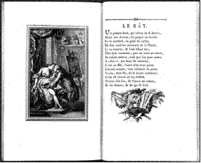
Graphic design often involves a collaboration of specialists. Many 18th-century artists specialized in book illustration. One such artist was Frenchman Charles Eisen, who illustrated French poet Jean de La Fontaine's Contes et nouvelles en vers (1762; Tales and Novels in Verse). In this work, Joseph Gerard Barbou, the printer, used types and ornaments by Fournier, full-page engravings by Eisen, and complex spot illustrations and tailpieces by Pierre-Phillippe Choffard. This superb example of Rococo book design combined the ornamented types, decorative initials, elaborate frames and rules, and intricate illustrations typical of the genre.
Illustrations: 1. Two-page spread from Jean de La Fontaine's Contes et nouvelles en vers (1762), printed by Joseph Gerard Barbou and illustrated by Charles Eisen. Library of Congress, Rosenwald Rare Book Collection
UNIT VIII
VERBS & COMBINATIONS WITH VERBS
1. to advocate smth ['ædvəkeɪt] – отстаивать что-л
2. to draw inspiration from smb ['drɔ: ˌɪnspɪ'reɪ∫(ə)n] – черпать своё вдохновение в ком-л
syn. to seek inspiration from smth ['si:k ˌɪnspɪ'reɪ∫(ə)n] – искать вдохновения в чём-л
3. to inspire smb’s interest [ɪn'spaɪə] – подогреть чей-л интерес
4. to lay forth one’s statement ['leɪ 'fɔ:θ] – изложить свои мысли, высказаться
syn. to set forth one’s statement, to expound one’s statement, to state smth
6. to offer a transition between smth and smth else – выражать (являть собой) переход от чего-л к чему-л ещё
7. to provide a (crisp) counterpoint to smth [prə'vaɪd ə ('krɪsp) 'kaʊntəpɔɪnt] – (резко) контрастировать с чем-л
syn. to be in sharp contrast with smth
8. to result in smth [rɪ'zʌlt] – иметь (своим) результатом что-л
COMBINATIONS WITH ADJECTIVES
9. flawless technique ['flɔ:lɪs tək'nɪk] – безупречная техника (выполнения)
10. generous margins ['dʒen(ə)rəs] – большие (букв. щедрые) поля (страницы)
11. obsessive detail [əb'sesɪv 'di:teɪl] – скрупулезная подробность (изображения)
12. sparse pages ['spɑ:s] – немногочисленные страницы
ADVERBS
13. superbly [s(j)u:'pз:blɪ] (designed types) – великолепно, роскошно, богато (выполненный шрифт)
PROFESSIONAL TERMS
14. axis ['æksɪs] (pl axis ['æksi:s]) – ось
15. line-spacing ['laɪn ˌspeɪsɪŋ] – междустрочный интервал
16. rectilinear curvilinear [ˌrektɪ'lɪnɪə]– прямолинейный
ant. v.s. UNIT VII: curvilinear – криволинейный
17. serif ['serɪf]– засечка, отсечка (на концах основных штрихов литеры), шрифт с засечками. Шрифт без засечек называется “sans serif” (от французского sans – “без”). В некоторых типографских источниках шрифт без засечек называют “гротесковым” или “готическим”, шрифт с засечками – “ романским”. v.i. UNIT IX
CULTUROLOGICAL & HISTORICAL TERMS
18. the Didots [dɪ'dɔ:z] – семейство Дидо (семья французских типографов, издателей и книготорговцев 18 и 19 веков)
19. Firmin Didot [fə'men dɪ'dɔ:] – Фирмен Дидо (1764 – 1836)
20. Pierre Didot ['pjer dɪ'dɔ:] – Пьер Дидо (1761 – 1853)
21. Giambattista Bodoni [ˌʒɑ:mbə'tɪstə bə'dɒnɪ] – Джамбаттиста Бодони(1740 – 1813) – итальянский типограф
22. Horace – Гораций (65 BC – 8 BC) – древнеримский поэт “золотого века” римской литературы
23. Jacques-Louis David ['ʒɑ:k 'lwi: də'vɪd] – Жак Луи́ Дави́д (1748 – 1825) – французский художник, основоположник французского неоклассицизма
24. John Baskerville ['dʒɒn 'bɑ:skəvɪl] – Джон Баскервилл (1706 – 1775) –английский типограф и словолитчик
25. Jean de Lafontaine ['ʒɑ:ŋ də lə fən'ten] – Жан де Лафонтен (1621 – 1695) – французский баснописец.
26. neoclassical [ˌni:əʊ'klæsɪk(ə)l] – неоклассический
i.e. относящийся к течениям в искусстве второй половины XIX – XX вв., творческая практика которых основывалась на стилизации внешних форм искусства античности, эпохи Возрождения и классицизма.
27. Vergil ['vɜ:dʒəl] – Вергилий (70 BC – 19 BC) – знаменитейший поэт Августовского века
THE 18TH CENTURY NEOCLASSICAL GRAPHIC DESIGN
In the second half of the 18th century, some designers tired of the Rococo style and instead sought inspiration from Classical art. This interest was inspired by recent archaeological finds, the popularity of travel in Greece, Italy, and Egypt, and the publication of information a
Последнее изменение этой страницы: 2016-07-23
lectmania.ru. Все права принадлежат авторам данных материалов. В случае нарушения авторского права напишите нам сюда...