Категории:
ДомЗдоровьеЗоологияИнформатикаИскусствоИскусствоКомпьютерыКулинарияМаркетингМатематикаМедицинаМенеджментОбразованиеПедагогикаПитомцыПрограммированиеПроизводствоПромышленностьПсихологияРазноеРелигияСоциологияСпортСтатистикаТранспортФизикаФилософияФинансыХимияХоббиЭкологияЭкономикаЭлектроника
WILLIAM MORRIS AND THE PRIVATE-PRESS MOVEMENT
During the 19th century, one by-product of industrialism was a decline in the quality of book design and production. Cheap, thin paper, shoddy presswork, drab, gray inks, and anemic text typefaces were often the order of the day. Near the end of the century, a book-design renaissance began as a direct result of the English Arts and Crafts Movement. William Morris, the leader of the movement, was a major figure in the evolution of design. Morris was actively involved in designing furniture, stained glass, textiles, wallpapers, and tapestries from the 1860s through the 1890s. Deeply concerned about the problems of industrialization and the factory system, Morris believed that a return to the craftsmanship and spiritual values of the Gothic period could restore balance to modern life. He rejected tasteless mass-produced goods and poor craftsmanship in favour of the beautiful, well-crafted objects he designed.
In 1888 Morris decided to establish a printing press to recapture the quality of books from the early decades of printing. His Kelmscott Press began to print books in 1891, using an old handpress, rich dense inks, and handmade paper. Decorative borders and initials designed by Morris and woodblocks of commissioned illustrations were cut by hand. Morris designed three typefaces based on types from the 1400s.
The Kelmscott Press recaptured the beauty and high standards of incunabula, and the book again became an art form. The press's masterpiece is the ambitious 556-page The Works of Geoffrey Chaucer. Four years in the making, the Kelmscott Chaucer has 87 woodcut illustrations from drawings by renowned artist Edward Burne-Jones. For the single work, Morris designed 14 large borders, 18 smaller frames for the illustrations, and over 200 initial letters and words. An exhaustive effort was required by everyone involved in the project.
The influence of William Morris and the Kelmscott Press upon graphic design, particularly book design, was remarkable. Morris's concept of the well-designed page, his beautiful typefaces, and his sense of design unity – with the smallest detail relating to the total concept – inspired a new generation of graphic designers. His typographic pages, which formed the overwhelming majority of the pages in his books, were conceived and executed with readability in mind. Morris's searching reexamination of earlier type styles and graphic-design history resulted in a major improvement in the quality and variety of fonts available for design and printing.
The Kelmscott Press's influence became immediately apparent in the rise of the private-press movement: printers and designers established small printing firms to design and print carefully crafted, limited-edition books of great beauty. The followers of the movement believed strongly in the social value of making attractive and functional visual communications that were available to citizens of all walks of life.
In the United States, book designer Bruce Rogers, also inspired by the Arts and Crafts Movement, played a significant role in upgrading book design. By applying the ideals of the beautifully designed book to commercial production, Rogers set the standard for well-designed books in the early 20th century. Type historian Beatrice Warde wrote that Rogers “managed to steal the Divine Fire which glowed in the Kelmscott Press books, and somehow be the first to bring it down to earth.”
UNIT XI
In order of appearance:
1. Art Nouveau – “Ар-нуво” (“Новое искусство”) – is an international philosophy and style of art, architecture, applied art and furniture design most popular during 1890 – 1910 and inspired by natural forms and structures characteristic of curved lines found in flowers and plants. In Russia it is known also as “Modern” (Модерн).
2.sinuous curvilinear line – волнистая криволинейная линия
3. Ukiyo-e– “укийо-э”–(literally "pictures of the floating world") – is the main artistic genre of woodblock printing in Japan produced between the 17th and the 20th centuries, featuring motifs of landscapes, tales from history, the theatre, and pleasure quarters.
4. tobecome aware ofsmth – узнать о чём-л
5. tonal modeling – тональное моделирование (в живописи: передача формы с помощью цветовых оттенков)
6. attribute of smth – отличительная черта, свойство, признак чего-л
7. Henri de Toulouse-Lautrec – Анри Тулуз-Лотрек (1864 – 1901) – was one of the greatest painters of the Post-Impressionist period, whose immersion in the colourful and theatrical life of Paris in the late 1800s yielded a collection of exciting, elegant and provocative images of the modern and sometimes decadent life of those times.
8. “La Goulue” – “Ла Гулю” (“the Glutton” – “Большеротая”, “Прожорливая”) was the stage name of Louise Weber (1866 – 1929) – a French can-can dancer also referred to as the “Queen of Montmartre”.
9. Moulin Rouge – Мулен Руж
10. to capture the atmosphere – уловить, передать на холсте атмосферу, настроение
11. to reduce smth to smth else – свести что-л к чему-л ещё
12. imagery – (собирательно) образы
13. casual technique – “лёгкая”, “небрежная” манера (выполнения рисунка)
14. Alphonse Mucha – Альфо́нс Му́ха (1860 – 1939) – was a Czech Art Nouveau painter and decorative artist.
15. to be widely regarded as smth – быть широко известным как …, считаться многими как …
16. (a design) featuring smb / smth – (композиция) представляющая кого-л / чего-л, (в которой представлены кто-л / что-л)
17. a tight composition – насыщенная (деталями) композиция
18. a sinuous female form – гибкая, волнообразная форма женского тела
19. Will Bradley (William H. Bradley) – Вилл (Уильям) Брэдли (1868 – 1962) – was an American Art Nouveau illustrator and artist. Nicknamed the "Dean of American Designers", he was the highest paid American artist of the early 20th century.
20. photoengraving – фототипия
21. undulating movement – волнообразное движение
22. Henry van de Velde–Хенри ван де Велде (1863 – 1957) – was a Belgian Flemish painter, architect and interior designer, one of the main founders and representatives of Art Nouveau in Belgium.
23. Frank Lloyd Wright – Фрэнк Ллойд Райт (1867 – 1959) – was an American architect and interior designer who followed the philosophy of “organic architecture” – designing structures which were in harmony with humanity and its environment.
24. Charles Rennie Mackintosh – Чарльз Ренни Макинтош (1868 – 1928) – was a Scottish architect, designer, watercolourist, artist and a designer in the Arts and Crafts movement and the main representative of Art Nouveau in the United Kingdom.
25. Frances Macdonald McNair – Фрэнсис Макдональд Макнейр (1873–1921) – was a Scottish artist who together with her husband Hertbert McNair and her more famous sister Margaret Macdonald propagated the Glasgow School style.
26. Margaret Macdonald Mackintosh – Маргарет Макдональд Макинтош (1865 – 1933) – was a Scottish artist who together with her husband, her sister, and Herbert MacNair was part of one of the Glasgow School groups known as "The Four".
ART NOUVEAU AND GRAPHIC DESIGN
Art Nouveau was an international design movement that emerged and touched all of the design arts – architecture, fashion, furniture, graphic, and product design – during the 1890s and the early 20th century. Its defining characteristic was a sinuous curvilinear line. Art Nouveau graphic designs often utilized stylized abstract shapes, contoured lines, and flat space inspired by Japanese ukiyo-e woodblock prints. Artists in the West became aware of ukiyo-e prints as trade and communication between Eastern and Western nations increased during the last half of the 19th century. Building upon the example of the Japanese, Art Nouveau designers made colour, rather than tonal modeling, the primary visual attribute of their graphics.

 One of the most innovative posters of the Art Nouveau movement was artist Henri de Toulouse-Lautrec's 1891 poster of the dancer La Goulue, who was then performing at the Moulin Rouge. Toulouse-Lautrec captured the atmosphere and activity of the dance by reducing imagery to simple, flat shapes that convey an expression of the performance and environment. Although Toulouse-Lautrec only produced about three dozen posters, his early application of the ukiyo-e influence propelled graphic design toward more reductive imagery that signified, rather than depicted, the subject. He often integrated lettering with his imagery by drawing it in the same casual technique as the pictorial elements.
 Alphonse Mucha, a young Czech artist who worked in Paris, is widely regarded as the graphic designer who took Art Nouveau to its ultimate visual expression. Beginning in the 1890s, he created designs – usually featuring beautiful young women whose hair and clothing swirl in rhythmic patterns – that achieved an idealized perfection. He organized into tight compositions lavish decorative elements inspired by Byzantine and Islamic design, stylized lettering, and sinuous female forms. Like many other designers at the time, Mucha first captured public notice for poster designs, but he also received commissions for magazine covers, packages, book designs, publicity materials, and even postage stamps. In this way, the role and scope of graphic-design activity steadily expanded throughout the period.
 Will Bradley, a self-taught American designer, emerged as another early practitioner of Art Nouveau. His magazine covers, lettering styles, and posters displayed a wide range of techniques and design approaches. Bradley synthesized inspiration from the European Art Nouveau and Arts and Crafts movements into a personal approach to visual imagery. By the 1890s, photoengraving processes (making printing plates from original artwork) had been perfected. These allowed much more accurate reproduction of original artwork than hand engraving, which was often only the engraver's interpretation of the original. Bradley's work, in which he integrated words and picture into a dynamic whole, was printed from plates using this new technology.
 Art Nouveau became a transitional movement from Victorian design to the modern art movements of the early 20th century, which is quite evident in the work of the Belgian artist and designer Henry van de Velde. After turning from Post-Impressionist painting to furniture and graphic design in the 1890s, he used lines and shapes inspired by the natural world and abstracted them to the point that they appeared as “pure form”; that is, they appeared as abstract forms invented by the designer rather than as forms from nature. In works such as his poster for Tropon food concentrate (1899), undulating linear movements, organic shapes, and warm-hued colours combine into a nonobjective graphic expression. Although this poster has been interpreted as signifying the process of separating egg yolks and whites, the typical viewer perceives it as pure form.
Similarly exploring issues of form, and inspired in part by the theories and work of the American architect Frank Lloyd Wright, architects Charles Rennie Mackintosh and J. Herbert McNair joined artists (and sisters) Margaret and Frances Macdonald in a revolutionary period of creativity beginning in the 1890s. This group in Glasgow, Scotland, combined rectangular structure with romantic and religious imagery in their unorthodox furniture, crafts, and graphic designs. In a poster it made for the Glasgow Institute of Fine Arts (1895), for example, the group's emphasis upon rising vertical composition is evident.
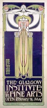 Illustrations: 1. Poster advertising La Goulue at the Moulin Rouge, by Henri de Toulouse-Lautrec, 1891 2. Moët & Chandon White Star Champagne – Alfons Mucha’s lithograph poster (1899), 3. Biscuits Champagne – Alfons Mucha’s French biscuits Lefèvre-Utile brand lithograph poster (1896) 4. Will Bradley’s Ault & Wiborg poster, (c.1895) 5. Henry van de Velde’s poster for Tropon food concentrate, 1899, 6. Frances MacDonald McNair’s The Glasgow Institute of Fine Arts poster (1895)
UNIT XII
In order of appearance:
1.Gustav Klimt
2. the Künstlerhaus
3. the Vienna Secession – “Венские раскольники”
4. to push (some idea, system, etc.) in an uncharted direction – развивать, продвигать (какую-л идею, систему) в неизведанном направлении
5. Koloman Moser
6. to blend (some components) into a modular whole – объединять (определённые компоненты) по модульному принципу
syn. v.s. UNIT I: to incorporate (some components) into smth
7. to define (some shape) – очерчивать (какую-л форму), обводить границы (какой-л. формы)
8. Josef Hoffmann –
9. to be instrumental in smth – играть ведущую роль в чём-л, содействовать чему-л
10. Lucian Bernhard –
11. to reduce smth to smth else – свести (т.е. упростить) что-л до чего-л ещё
12. bold shape – отчётливо прорисованная форма
cf. bold type – жирный шрифт (в полиграфии)
13. adherent – сторонник, последователь
syn. v.s. UNIT X: follower
14. Hans Rudi Erdt –
15. Julius Gipkens –
16. Julius Klinger –
17. concurrent with some development – созвучный какому-л направлению, течению, действующий в соответствии с какой-л тенденцией
18. Peter Behrens –
19. to subordinate smth to purpose – подчинять что-л цели
20. a farsighted industrialist – дальновидный предприниматель
21. to provide order – обеспечивать порядок
22. harbinger of smth – предвестник чего-л
23. to raise funds for the war effort – собирать (финансовые) средства на военную программу (военные нужды)
24. to encourage productivity at home – содействовать развитию внутреннего производства
25. to encourage enlistment in the armed forces – призывать (добровольцев) к поступлению на военную службу
26. to shore up citizens' morale – поддерживать моральный дух гражданского населения
27. the Axis – “Ось” (Германия и её союзники)
28. the Allies – “Союзники” (блок Великобритании, Франции и России во время 1-й Мировой войны, “Антанта”, “Тройственное согласие”)
EARLY DEVELOPMENTS OF GRAPHIC DESIGN IN THE 20TH CENTURY
In the first decade of the 20th century, the experiments with pure form begun in the 1890s continued and evolved. Although the Glasgow group received a cool reception in the British Isles, designers in Austria and Germany were inspired by their move toward geometric structure and simplicity of form. In Austria, a group of young artists led by Gustav Klimt broke with the Künstlerhaus in 1897 and formed the Vienna Secession. These artists and architects rejected academic traditions and sought new modes of expression. In their exhibition posters and layouts and illustrations for the Secession magazine, Ver Sacrum, members pushed graphic design in uncharted aesthetic directions. Koloman Moser's poster for the 13th Secession exhibition (1902) blends three figures, lettering, and geometric ornament into a modular whole. The work is composed of horizontal, vertical, and circular lines that define flat shapes of red, blue, and white. Moser and architect Josef Hoffmann were instrumental in establishing the Wiener Werkstätte (“Vienna Workshops”), which produced furniture and design objects.
The German school of poster design called Plakatstil (“Poster Style”) similarly continued the exploration of pure form. Initiated by Lucian Bernhard with his first poster in 1905, Plakatstil was characterized by a simple visual language of sign and shape. Designers reduced images of products to elemental, symbolic shapes that were placed over a flat background colour, and they lettered the product name in bold shapes. Plakatstil gained numerous adherents, including Hans Rudi Erdt, Julius Gipkens, and Julius Klinger.
Concurrent with these developments, in Germany Peter Behrens played an important role in graphic design. Behrens helped to develop a philosophy of Neue Sachlichkeit (“New Objectivity”) in design, which emphasized technology, manufacturing processes, and function, with style subordinated to purpose. In 1907 Emil Rathenau, head of the AEG (Allgemeine Elektricitäts-Gesellschaft, a vast electrical manufacturing firm), appointed Behrens as artistic adviser for all of AEG's activities. Rathenau, a farsighted industrialist, believed industry needed the visual order and consistency that could only be provided by design. For AEG, Behrens developed what may be considered the first cohesive “visual identity system”; he consistently used the same logo, roman typeface styles, and geometric grids to create product catalogs, magazines, posters, other printed matter, and architectural graphics. Behrens's work for AEG was a harbinger of a major area of graphic design in the second half of the 20th century: the creation of a corporate identity through a program using trademarks, typefaces, formats, and colour in a consistent, controlled manner.
In addition to such aesthetic, commercial, and corporate purposes, graphic design also played an important political role in the early 20th century, as seen in posters and other graphic propaganda produced during World War I. Colour printing had advanced to a high level, and governments used poster designs to raise funds for the war effort, encourage productivity at home, present negative images of the enemy, encourage enlistment in the armed forces, and shore up citizens' morale. Plakatstil was used for many Axis posters, while the Allies primarily used magazine illustrators versed in realistic narrative images for their own propaganda posters. The contrast between these two approaches can be seen in a comparison of German designer Gipkens's poster for an exhibition of captured Allied aircraft with American illustrator James Montgomery Flagg's army recruiting poster (both 1917). Gipkens expressed his subject through signs and symbols reduced to flat colour planes within a unified visual composition. In contrast, Flagg used bold lettering and naturalistic portraiture of an allegorical person appealing directly to the potential recruit. The difference between these two posters signifies the larger contrast between graphic design on the two continents at the time.
UNIT XIII
Последнее изменение этой страницы: 2016-07-23
lectmania.ru. Все права принадлежат авторам данных материалов. В случае нарушения авторского права напишите нам сюда...